Home » Learning Curve » Developers Workshop
The Evolution of StyleThings aren't always for the best.
It's now in the aftermath of 10.6.3 that the revelations start manifesting themselves. Snow Leopard users have been anxiously awaiting the 10.6.3 update as they have any number of inexcusable minor flaws they desperately want corrected and as they're continually afraid something else is going to break.
There have already been reports to this site about continued snags with the obsequious table view, orphans remaining in Mail.app, and even the launch services crashing inside the Spotlight code base.
This can hardly be a popular topic at the weekend of the iPad launch but (strange as it may seem) there are some people who still use Apple's 'computer' OS - and they find themselves taking a back seat to the new technologies that represent the new revenue streams for the Cupertino company.
'All the interface experts are on the iPhone and iPad teams, so OS X is 'taken care of' by incompetents. This is so obvious in so many areas that I wonder how long before they ditch the desktop and focus solely on their mobile platforms.'
Indeed. A quick comparison of where graphics and consistency in graphics have gone in the past five years makes it rather obvious that those in charge of the OS X ship aren't the most experienced in the field - not from a general programming point of view, not from a more specific 'OS X' point of view, and not even from a very generic 'computer use' point of view.
The people who helped put OS X on the map have gone on to other projects, leaving exactly who behind to maintain the code?
Not a popular topic. Certainly not at this weekend of all weekends. But there you have it.
The following is but one example: Cocoa table views and table view headers from the three most recent iterations of OS X.
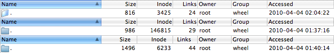
Perhaps forget that washed-out icon used in the uppermost 10.4 part of the graphic. But aside from that, the 10.4 version is definitely more 'brilliant' and 'lickable'. The middle part - from 10.5 - shows more shading in the column headers. Almost too much. And like its successor 10.6, it readily adopts a more 'sober' approach - something some describe instead as 'dull'.
But it's in the right-aligned column headers for 10.6 (the lowermost part) that one sees there's a clue vacuum in Cupertino on this side of the business. Perfect alignment is never possible as these aren't fixed pitch fonts - but putting the headers such as 'Size', 'Inode', and 'Links' so far to the left when they're supposed to be right-justified?
The indent on the right should match the indent on the left. Obviously. Somebody new to the game in Cupertino needs to get a clue fast. But odds are Apple management are too busy with other things - and bigger revenue streams - to even care.
|