Home » Learning Curve » Red Hat Diaries
Windows Se7en: Crappiest Graphics in the IndustryWhere does all the money go? By Tony 'Tokyo' Rhoades.
Hey you MSFT guys: you got more money than anyone. A lot more than Richard Stallman and the GNOME and KDE people - and yet their graphics are at least as good as yours. And now Mark Shuttleworth says he wants to take on mighty Apple in the graphics game - so why are you so far behind? Why do your interfaces give users an undeniable feeling you just don't care? And can't 'perform' even if you want to?
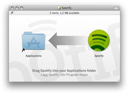
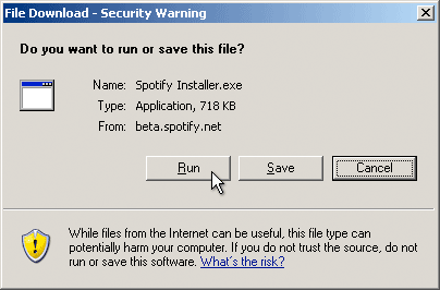
Here are two images from the Spotify website. One is for instructions on how to install Spotify on a Mac, the other's for your - ahem - 'system'.
Seriously: this is 2009 now and your graphics are the same they've been for the past fifteen years. Twenty almost.
Seriously: the icon you got there is an almost twenty year old Susan Kare icon. Do you guys ever update anything at all? Or are you convinced your snowed-in user base are going to settle for whatever shit you give them?
And those push buttons - you still underline mnemonics? That's how far you've progressed? And that dotted ring around the focused button? You did that over twenty years ago! With Windows 1.0! Doesn't anything ever get better for your users?
And what's really mystifying is that all you seem to be concentrating on is applying more lip gloss to your ugly pig. Nothing's really changed underneath either.
It's the same old file system with drive letters, the same old system with that Achilles heel Registry, the same old backslash, the same old 'C:\Program Files', the same old 'who owns what' standalone mentality, the same old system weaknesses, the same raping and pillaging by the black hats - what are you peddling anyway?
Heroin?
Let's look at the images in my previous article and blow them up a bit. Here are the original images.
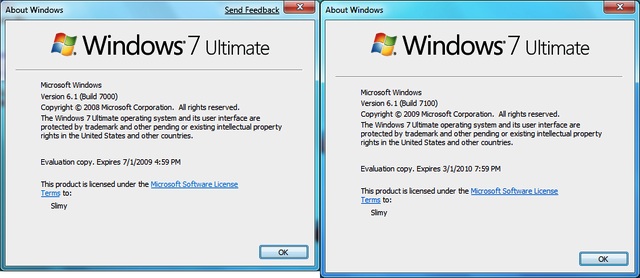
Now let's blow parts of them up a bit. Here's the dazzling title bar.

What's that fuzzy white shadow around 'About Windows'? Is that supposed to be sexy? Or just dumb? Was it Photoshopped by a seven year old? Someone's nephew?
And how about that great 'close' button in the upper right? You can see exactly what graphics are used - three lines of gradient gray. Not exactly impressive. Windows 95 warmed over. Let's look at that part again.

Wow. Hot shit! Now let's look at what Apple do with close, minimise, and zoom buttons.

Note how the individual pixels - clearly visible in this x10 blowup - are carefully graded. And there's not only shadow but 'light reflection' in there. Each image is 15x15 or 225 pixels - counting the 'shared' ones.
That's class you don't have.
Apple use gradient shadowing all over the place. They use it in their window shadowing, they use it in their 'textured' (metallic) windows. These aren't easy algorithms. But Apple engineers aren't worried about making an effort.
Here once again is your 'program file' icon. Twenty years ago this was a big deal. But right beside it: Apple's counterpart.
 
Gee what a difference.
- Apple use floating point screen coordinates and colours. And their colours include a floating point alpha channel value. NTx uses 32-bit integers (and 9x used 16-bit integers) for coordinates and both systems still use 8-bit colour values. As for alpha channel: you can mostly forget it.
- On Mac OS X you need to draw miniscule rectangles with sides less than one pixel in length to achieve raster graphics effects. This because the entire system is vector-based. On Windows you can't achieve Apple's vector graphics at all - just look at the screen dumps.
- Apple make every effort to offer their users the classiest experience possible. But you Microsoft people don't make an effort at all. You might lack the expertise but more than that: you don't give a shit.
- Yes you have that pathetic 'Aero' - named after Apple's 'Aqua' obviously. But it's crap and you know it (see screenshots above) and it requires totally new hardware (about twice the horsepower of Apple's and what's really needed) and for that your customers have to shell out a walloping $319.99. Upgrades for Apple's new Snow Leopard cost only -$29-.
Mac OS X looks sexier than ever. All you do is put more lipstick on your fugly pig. And hardly that.
Oink oink.
Best,
Tony 'Tokyo' Rhoades
See Also
Red Hat Diaries: Hey MSFT Guys!
|